#
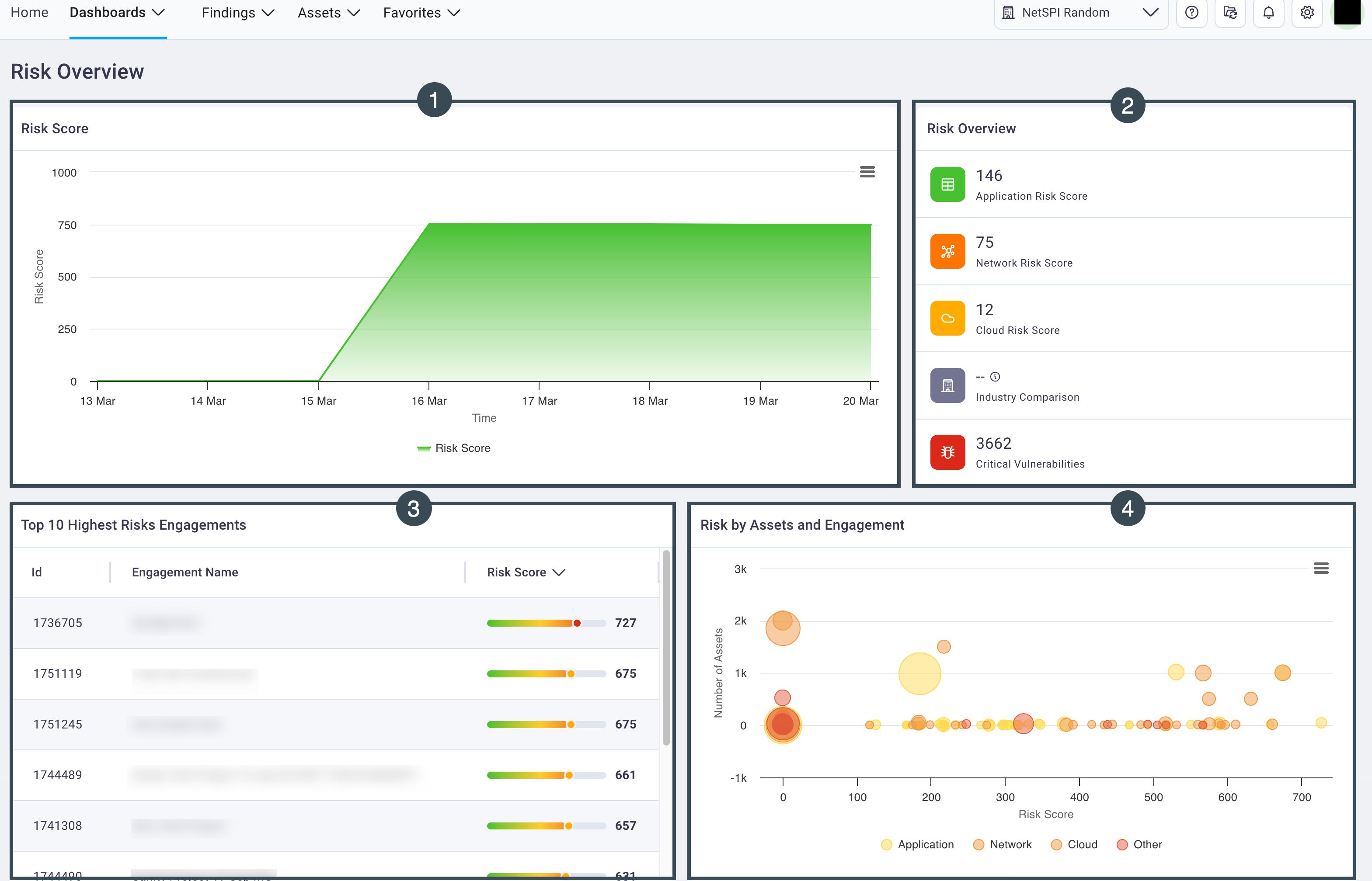
Risk Overview dashboard
The Risk Overview dashboard provides several views of your organization’s risk: a risk score, risk overview, the top-10 highest risk engagements, and a bubble chart of risks by assets grouped by engagement.
#
1. Risk Score
The overall Risk Score for your organization is presented as a box plot chart.
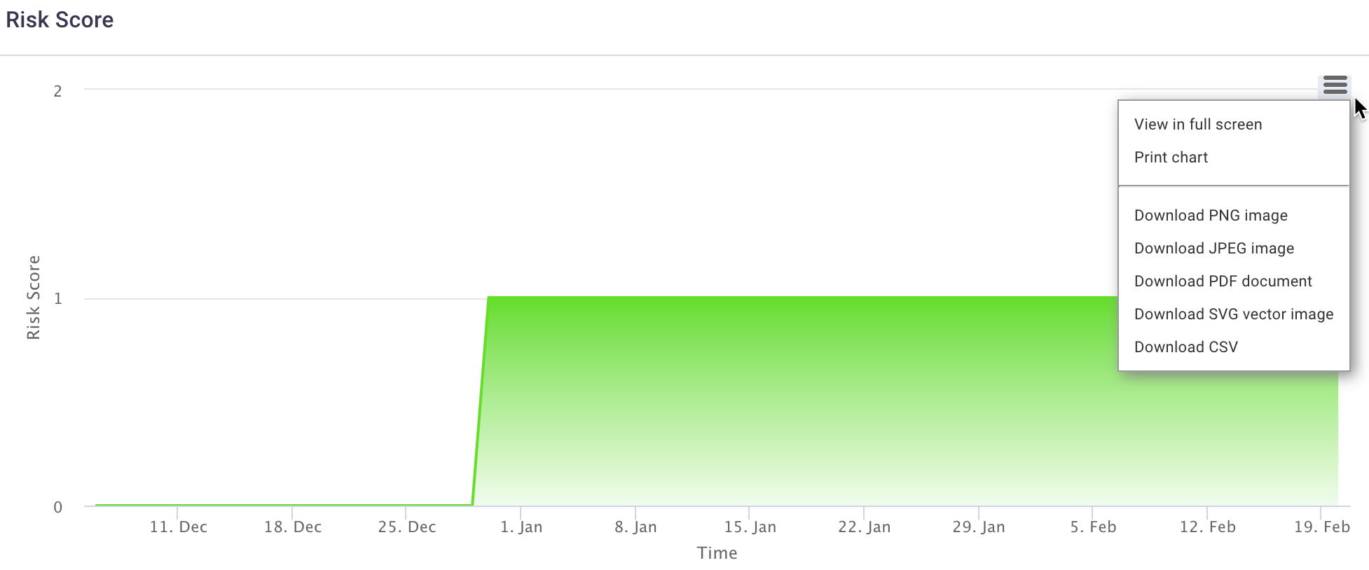
- Hover over the box plot chart to view specific dates for risk score spikes.
- Select the hamburger button to display a menu of options of actions you can take on the Risk Score chart and its data.
#
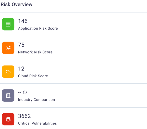
2. Risk Overview
The Risk Overview section is a high-level, view-only display of risk scores broken out by cybersecurity areas: application, network and cloud and also include a risk score for your organization in comparison to other industries and a total count of critical vulnerabilities.
#
3. Top 10 Highest Risk Engagements
The Top 10 Highest Risk Engagements displays the engagement ID, name, and risk score for your organization’s engagements that have the highest risk.
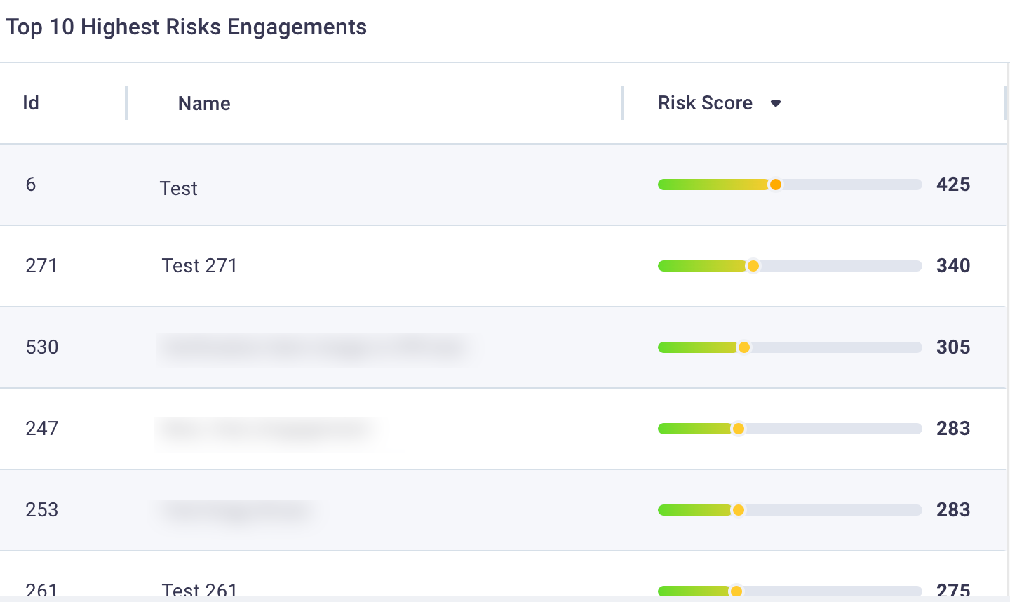
- Select any row to display the Engagement Details page for that engagement.
#
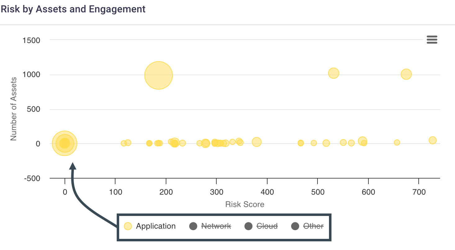
4. Risks by Assets and Engagement
The Risks by Assets and Engagements bubble chart allows you to get a quick view of the highest risk scores by engagement, including the number of assets and findings that contributed to that risk score.
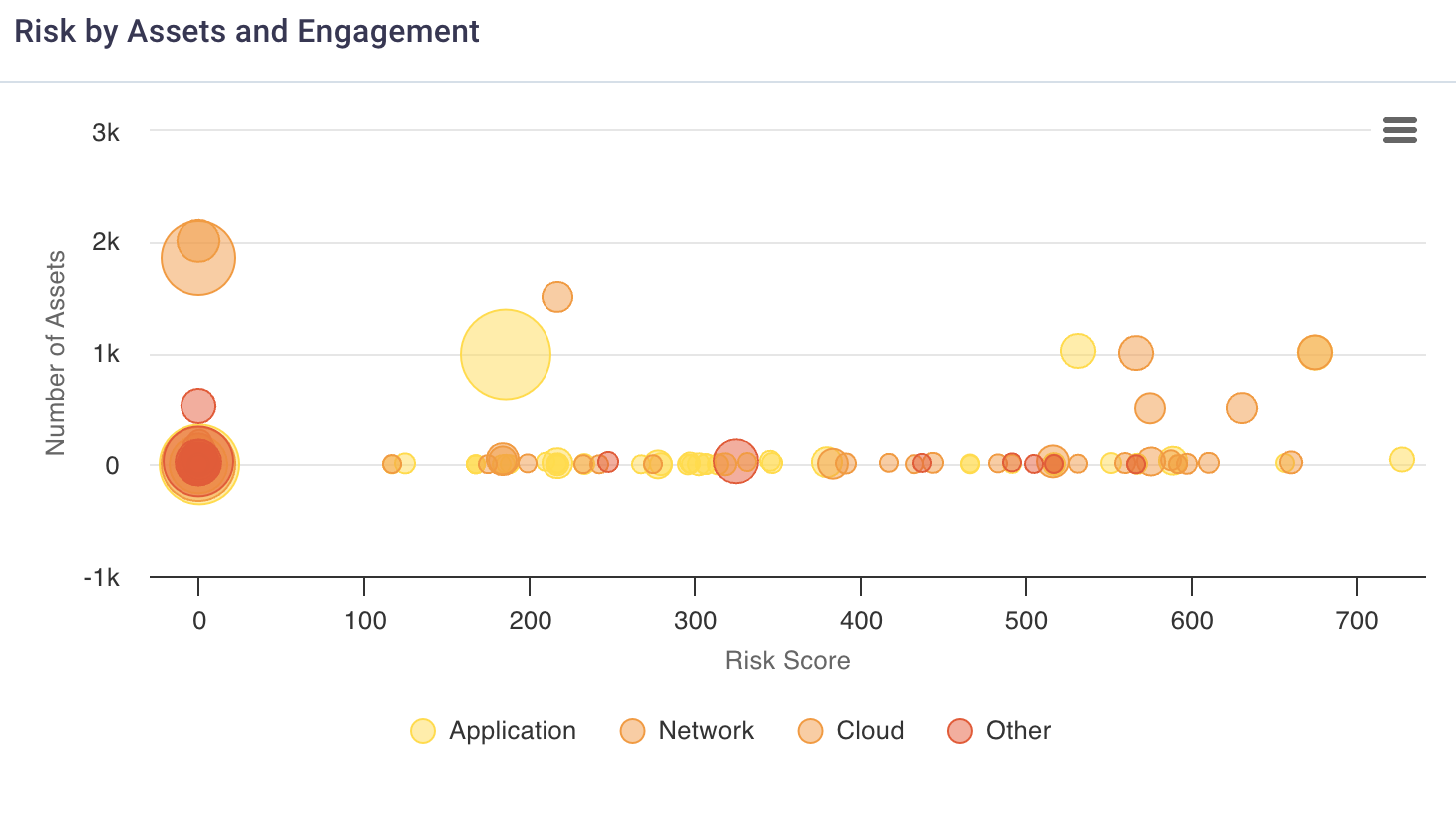
Select the hamburger button to display a menu of options of actions you can take on the Risk by Assets and Engagement bubble chart.
Hover over any engagement bubble in the bubble chart to view risk score and a count of assets and findings for that engagement.
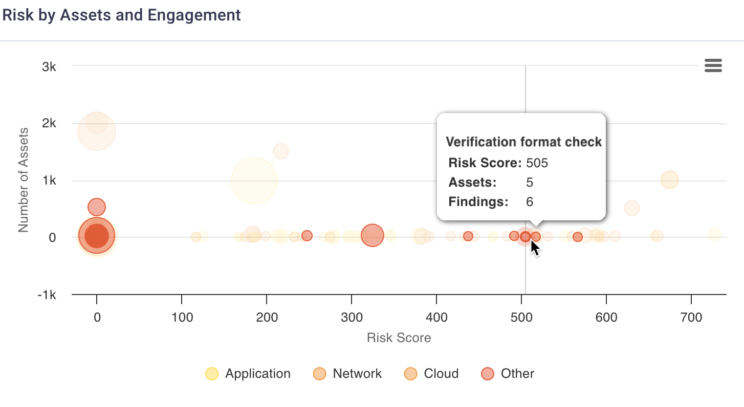
- Select any asset type in the bubble chart's legend (under the X axis) to toggle it off/on for the chart display to exclude/include specific asset types.